

Video Player is loading.
Dyslexia Scotland - "There's Nothing Comic About Dyslexia"

This ad is part of the ACT Responsible Collection
- Brand: Dyslexia Scotland
- Country: Germany
- Advertiser: Dyslexia Scotland
| Title | There's Nothing Comic About Dyslexia |
| Brief | Comic Sans is the most polarising font to date, due to its highly asymmetrical nature. While this irregularity makes it popular amongst the dyslexic community, it is also what makes designers despise it so much.By deconstructing Comic Sans, we were able to determine the characteristics that make it one of the most dyslexia-friendly fonts. Then, we used them to inspire a new typeface that adopts the same irregularity, except this time, in an aesthetically pleasing way.Inconstant Regular was created to bridge the gap between design and inclusivity, through its irregular shapes, three stylistic sets, and built-in variable accessibility features. Making it a font that can be tailored to fit infinite individual needs and desired typographic aesthetics. |
| Agency | INNOCEAN Europe |
| Campaign | There's Nothing Comic About Dyslexia |
| Advertiser | Dyslexia Scotland |
| Brand | Dyslexia Scotland |
| Date of First Broadcast/Publication | Subscribers Only |
| Business Sector | Subscribers Only |
| Story | Subscribers Only |
| Media Type | Case Study |
| Length | |
| Executive Creative Director | R....do W...f Subscribers Only |
| Art Supervisor | M..o H..k Subscribers Only |
| Associate Creative Director | A..a B...in Subscribers Only |
| Associate Creative Director | A...és A....de Subscribers Only |
| Designer | E...e C....el Subscribers Only |
| Designer | P...a S...os Subscribers Only |
| Business Director | M..k P....on Subscribers Only |
| Producer | V....ia Pre.......ogel Subscribers Only |
| Producer | ..n V...l Subscribers Only |
| Associate Creative Director | M....lo Pi.....ri Subscribers Only |
| Public Relations | E...e B....od Subscribers Only |
| Design | D...el Br....ad Subscribers Only |
| Creative Director | D...el Br....ad Subscribers Only |
| Chief Creative Officer | G....el M...ar Subscribers Only |
| Designer | J...a S...se Subscribers Only |
| Copywriter | N..a F...y Subscribers Only |
| Creative Strategy | O...e B...fa Subscribers Only |
| Photographer | R...ar S....ck Subscribers Only |
| Designer | N..a Be....ia Subscribers Only |
| Designer | J...os H...r V..ri Subscribers Only |
| Chief Executive Officer (CEO) | C...y M...e Subscribers Only |
| Creative Lead | K...e Ca.....ael Subscribers Only |


More Work
SEE ALL
A Moving Power
- BRAND:
- Kia EV3
- AGENCY:
- INNOCEAN Berlin
The Kia Instrument
- BRAND:
- Kia
- AGENCY:
- INNOCEAN Europe

Kia Instrument
- BRAND:
- Kia
- AGENCY:
- INNOCEAN Europe

Inconstant Regular
- BRAND:
- Dyslexia Scotland
- AGENCY:
- Innocean Worlwide Berlin
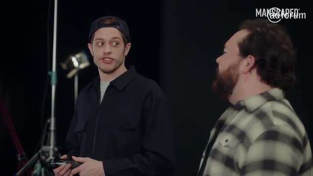
The Stand-In
- BRAND:
- Manscaped
- AGENCY:
- INNOCEAN Europe

Every Four Years FIFA World Cup 2022™
- BRAND:
- Kia
- AGENCY:
- INNOCEAN Europe
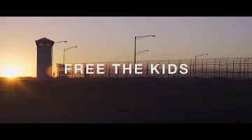
Free the Kids
- BRAND:
- Persil
- AGENCY:
- MullenLowe UK
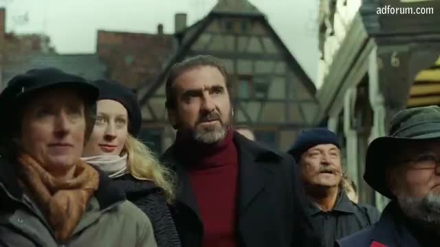
A Taste Suprême
- BRAND:
- Kronenbourg
- AGENCY:
- Ogilvy


